Rodney Lough Jr. asked on Facebook, discussing this image:
More Yosemite for Wednesday; here’s Reflections Along the Merced! What do you think, do you like black and white images? Do you want me to see more of them, or do you prefer color?
I commented:
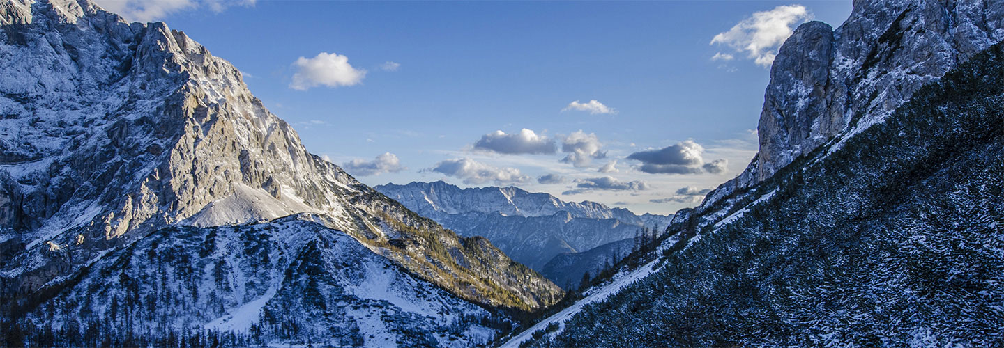
It seems to me that color almost always touches the heart more, perhaps because it more accurately shows off God’s creation, the way He made it. It shows His glory!
Rodney responded:
Thanks for your answers, everyone! Those of you who like color; don’t worry, I won’t stop releasing photos in nature’s glorious colors, including the image I’m going to be releasing in a little more than a week, Cathedral Forest. Those of you who like black and white, though… Well, I guess I’ll just say stay tuned
______________
Here is more on my perspective. I just shared this with a Facebook friend who prefers black and white:
… I’ve studied Ansel. I like some of his work, and have seen some of his originals in Monterey. He can emphasize a particular feature with extreme contrast, etc., making a piece of rock look really gnarly, and the sky super dark, for example. And I do like his later darkroom technique over his earlier, where he was more conservative. But I still don’t get the ‘awe’ factor that I get with many color photos.
In this photo, one of my favorites of his, Ansel used a red filter to greatly darken the sky, etc., and heavy dodging and burning. It does emphasize how mighty this piece of rock is. And it may be more stunning than the color photo would be, taken during that same moment, especially if it was midday. But to me, a color photo taken during the right light could still be even much more impressive.
In general, in order to make a black and white look impressive, the photographer has to tone down certain colors and/or crank certain tones up, because a green tree will only look dissimilar in shape to the cliff behind it if they’re both the same brightness. So the photographer might greatly brighten the tree while darkening the cliff, so they can be more distinguishable.
The end result of doing that throughout a photograph for the different elements may be interesting, and draw me in to look at the photo more (which is good), but these photos rarely make me rejoice.
Another possible factor, which I don’t understand why it’s taking so long to solve, is that most computer monitors aren’t color accurate without being specially calibrated, which mostly only photographers do. So the photos don’t look the way they’re supposed to. If you ever get to see a Rodney Lough Jr. gallery in person, please do.
Accurate color isn’t a high priority for most consumers, so computer manufacturers can probably make a screen brighter without subduing certain colors in order to present color naturally.
Many people lose their color accuracy as they get older too. I think it’s probably a nutritional deficiency, mainly, and older photographers may have a hard time getting the colors right, so end up doing black and white instead.
Leave a Reply