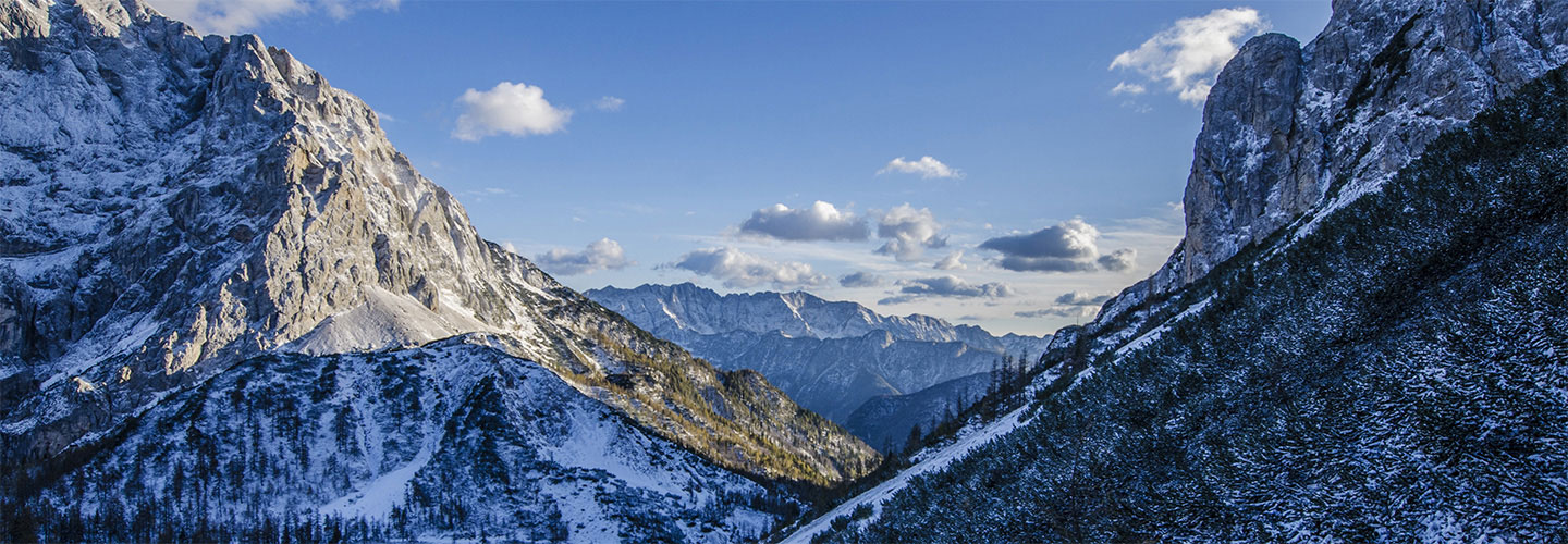
I find image #10 to be a great example of what starts out looking like just a ho-hum 4×5 image, but then it’s transformed into a gorgeous pano, in this case in a 2.2:1 ratio.
True, the original starts out in RAW, which is duller than how it looked in the real world. Adding in the appropriate saturation, contrast, etc. made a difference, and he did give the sky an extra boost. But to me, what makes the image work so well is how Adam Gibbs cropped it.
I love the result, and especially how the original capture just didn’t look that appealing. What a difference creative cropping to the appropriate format can make!
The video should start on Image #10
🔘 Tenth Photograph: 22:27

Leave a Reply