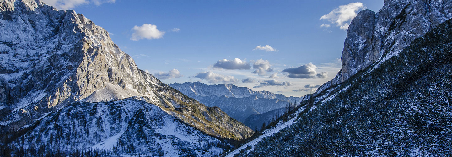
Two articles excerpted below. The first shows through some photographic examples how many scenes or subjects work best in one aspect ratio and not as well in others. I would like to see all mirrorless cameras have some type of multi-aspect ratio sensors so various aspect ratios can be chosen, all having the widest field of view — instead of having to crop from 3:2 or 4:3, which loses field of view and pixels.
Aspect Ratio: What it is and Why it Matters
A Post By: Andrew S. Gibson
You can see that the 3:2 aspect ratio used by most digital SLRs is slightly longer than the 4:3 micro four-thirds frame. This may not seem like much, but it has great implications for composition. Take a look at the following images to see why. …
The 35mm frame is longer. And that can be challenging when it comes to composition, because you have to find a way of filling that length effectively. …
For me, the 7:6 aspect ratio is too short, but 5:4 is a very pleasing aspect ratio to work in.
Now, so far you may be thinking that the difference between aspect ratios is not a big deal. And often, when you are using the landscape format (ie. the camera positioned so that the frame is horizontal), the difference is minimal. It’s not so difficult to work within any of the above aspect ratios.
But change to the portrait format (a vertical frame) and it’s a different story. The 35mm frame suddenly becomes a lot harder to fill effectively, and the composition often benefits from cropping to a shorter rectangle. Here are some examples….
The following article is from: Abolish 3:2 (35mm), written by Bruce Percy; though, Bruce says sometimes 3:2 is the best ratio for a given scene.
As for myself, I don’t want to abolish any aspect ratios, but see cameras offer a multitude of aspect ratio choices in full field of view, by having multi-aspect ratio sensors.
3:2 aspect ratio.
Perhaps I should write a good article about this one. But the aspect ratio is simply too wide and narrow. Turn it portrait and it’s too tall and too skinny. Most folk tend to use ultra-wides to stretch the landscape across the width (landscape) or height (portrait) to use up the real-estate of the sensor. This makes for shape and tonal relationship between objects within the frame more of a leap from one object to another than it should be. Using a square format, or a ‘fatter’ rectangle such as 4:5 allows you to keep all the objects in the scene in close proximity, and therefore, allow them to have a tighter relationship between each other. 35mm, in my opinion sucks (most of the time).
I would like to finish by saying that not all scenes work in one aspect ratio all the time. I often find that most scenes do work in 4:5 for instance and don’t translate well to 3:2, but conversely, I’ve sometimes found that a scene I’ve got to work really well on a 3:2 camera doesn’t translate well to 4:5. It seems that some scenes were made for 35mm while others were made for 4:5. My personal preference is for 4:5 or 6:7 though, and moving towards 1:1 allows you to become even simpler with your compositions.

Leave a Reply